


This blog has been updated on – March 05, 2024
Data visualization analytics has the potential to streamline data interpretations and analyses for businesses. From visualizing market trends to analyzing team productivity, most business leaders rely on graphical representations and charts for a holistic view of business insights.
The high adoption of Business Intelligence (BI) and automation in businesses resulted in a massive volume of data. Organizations use custom dashboards and graphs to streamline big data management and analytics to avoid unstructured and structured data inconsistencies.
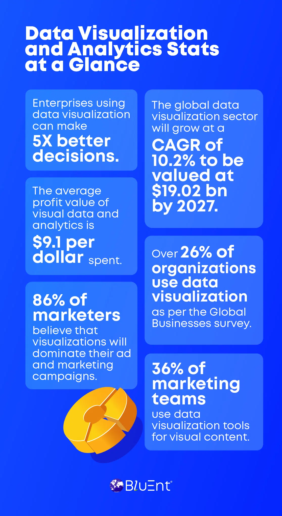
A recent study cited the global data visualization market to grow at an impressive CAGR of 10.2%, valued at $19.20 billion by 2027. It stated that data visualization tools will contribute to sales productivity with an increase of 44%.
There is no denying the fact that data visualization is the next big thing for enterprises working with data integration and management tools.
Let’s see how data visualization works, along with a brief on the types and benefits of opting for the same.
Table of Contents:
What is Data Visualization Analytics?
Did you know? 50% of the human brain is active in visual processing. Something to ponder about if you’re wondering about visualizing data.
Data visualization is a technical term for viewing numerical figures and textual statistics in a graphical format. It combines big data insights and tools to get impactful graphs, charts, dashboards, infographics, and more visuals.
Both data visualization and analytics come together to bring a clear picture of:
-
Industry trends, behavioral patterns of customer analytics, and other market insights derived from surveys, opinion polls, and discussion channels.
-
Business revenues and return-over-investment for comparative sales data analysis, costs of infrastructure and workforce, and other expenses.
-
Efficacy of online marketing campaigns, ads, and promotions across websites, social media, emails, apps, and other platforms. For instance, marketers use big data in sales and marketing with tools like Google Analytics to view traffic, engagement, conversions, and demographic details of users.
-
The quality, accuracy, and intuitiveness of custom reporting dashboards shared by clients, managers, and internal teams in real-time. For example, human resource professionals use leave and attendance management software for remuneration and employee productivity analysis.
-
Accuracy and relevancy of visual insights on research papers and surveys published by top market analysts and agencies. That will include growth charts, yearly charts, tables, maps, and other visual representations showcasing figures and facts.
Data visualization adds value to business strategies and decision-making. Now, let’s understand more reasons to prioritize data visualization analytics in your business plan.
Upscale your business profits with big data analytics and get actionable insights for better decision-making.
Recommended Reading:
Importance of Data Visualization and Analytics
By 2027, an individual, on average, will generate over 463 exabytes of data in a day.
Data visualization techniques garnered a major significance among enterprises using advanced database integration and management tools like MuleSoft.
Let’s understand the reasons why visualizing data is crucial for leading organizations:
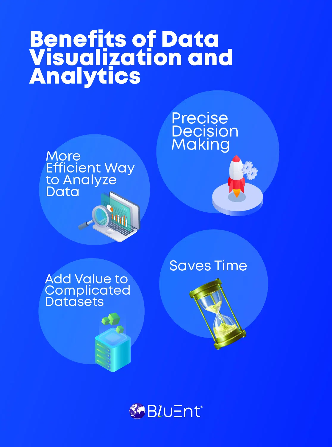
More Efficient Way to Analyze Data
Big data implementation provides ample opportunities to view and analyze data quickly. Business strategists use data visualization tools to extract data and generate visual reports. Upon analyzing the insights, they determine areas that need more attention.
This way, businesses can make precise decisions and gain profits quickly.
Precise Decision Making
Companies using data visualization tools can implement different types of data analytics to make faster and better decisions.
With the help of proficient data engineers, business leaders can view, identify, and predict future trends on a unified data visualization dashboard. That empowers them to refine their strategies for higher revenues.
Added Value to Complicated Datasets
Data visualization enables users to detect minor errors in massive datasets. It also contributes to predictive analytics for risk management, allowing businesses to mitigate future vulnerabilities.
Saves Time
Data visualization analytics also helps organizations save time by handling large amounts of data and reporting delays in internal operations, reporting, and project delivery.
It gives them a quick glimpse of insights in tables, graphs, maps, and charts. Hence, it saves more time than other manual methods of data analysis.

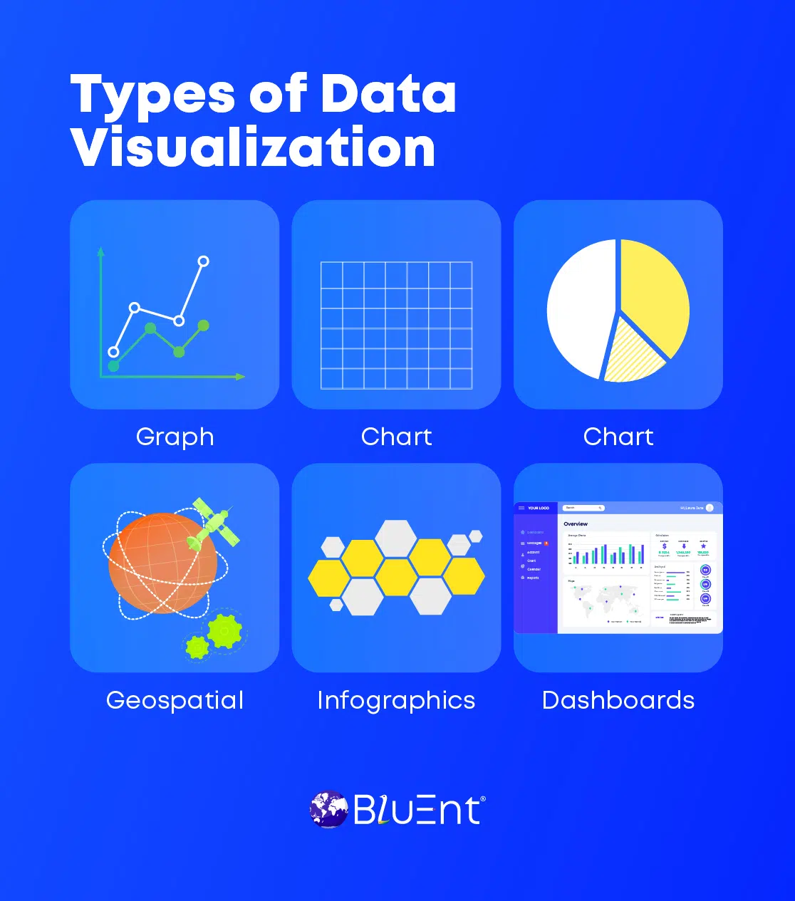
Types of Data Visualization
The types of data visualization outline different visual formats that represent facts and figures.
We’ve categorized some of the data visualization tools’ most popular yet essential elements.
Charts
Presenting data as charts is one of the best data visualization approaches.
Most professionals use charts to visualize and compare the changing data trends for a specific time.
Different types of charts are for reporting and presentations catered to specific audiences, teams, and businesses.
-
Number charts: Get a detailed summary of Key Performance Indicators (KPIs) and other metrics in a real-time and more interactive way.
The reports visible on Google Analytics for digital marketing use this data visualization method to deliver up-to-date metrics. That usually consists of site visits, engagement rates, conversion counts, etc.
-
Pie charts: These can ease the demonstration of figures in specific proportions, specifically in percentage composition. They go well with an easy-to-flow reporting format illustrating a typical pattern of variations in a particular timeline.
-
Gauge charts: These charts portray the expense ratio in different color schemes (green for low/good, yellow for medium/bad, and red for high/worse).
They’re primarily used in finance reports and dashboards to indicate progress against KPIs.
-
Bar or Column charts: They compare two or more areas of similar category.
Table
The table format displays figures in rows and columns. Heatmaps highlight tables, and text tables are data visualization tools to display data values.
Graph
Research papers and financial reports use graphs to portray information in lines, curves, segments, and curves along X and Y axis. The diagrams give a simplistic view of complex statistics for financial data analytics.
Geospatial
The most exciting data visualization and analytics tool uses maps that zoom into variations in countries, regions, and cities. It uses different colors to spot the geographical differences for specific parameters.
Infographics
The combination of textual information and graphics shapes infographics. Research data analytics teams, marketers, and business strategists use this data visualization tool for presentation and promotion.
Dashboards
The aggregation of multiple data visualization tools on one screen gives a clear-cut view of multiple data values.
Get Actionable Insights with the Power of Data Visualization Analytics Experts at BluEnt
Data visualization and analytics go hand in hand. Both involve data-driven practices to drive next-level data transformation, management, and analysis.
However, the outcomes of data analytics depend on the accuracy of data visualization and efforts made. Hence, your data scientists must have data visualization skills.
At BluEnt, we’re spearheading the pursuits of business consulting and enterprise data management in the domains of big data management, big data implementation, big data analytics and insights, and predictive analytics.
Besides being a trusted business, CAD Engineering, and IT partner for global firms, we’re recognized for our mastery of business intelligence, CRM solutions, business process management, enterprise mobility, enterprise content management, and more.
We’ve served hundreds of clients across the globe. Need help with integration, management, visualization, and business data analysis? Get in touch with certified data engineers today.
Frequently Asked Questions
What are the best data visualization techniques?
Every reliable data visualization and analysis expert implements these practices to achieve the best outcomes:
-
Understanding the audience and setting goals accordingly.
-
Selecting the correct chart or type of data visualization tool.
-
Refraining from unjustified or misleading information.
-
Incorporating color schemes to engage better.
-
Handling data for seamless aggregation and integration
-
Prioritizing layout, hierarchy, graphics, and text in balance
-
Adding comparisons and focusing on storytelling
-
Leveraging advanced data visualization tools.
Which are the most popular data visualization tools for analytics?
There are dozens of data visualization analytics tools available, but only a handful of them are most used by experts:
-
Tableau
-
Microsoft Power BI
-
QlikView
-
DataHero
-
Plotly
-
Looker
 How Financial and Accounting Services by BluEnt Drive Business Growth in the Digital Era?
  Secure Gift Cards: Top Tips and Strategies’ to Safeguard Personal Information
  Cloud Data Engineering: Infrastructure and the Road Ahead
  Real Time Analytics: Facets, Insights, and Use Cases